|
|
|
Colour maps:
- Colours by indices :
QL
(quality of life)
PW
(international influence)
MN
(national theats)
SO
(state consistency)
DM
(institutional foundations
of democracy)
-
Colours by
density
-
2D spectrum
|

|
|
Comments
Important! This page has an interactive Java applet. For its proper operation you need to enable JavaScript.
How to get information:
If you roll the mouse cursor over a pointer on the map, the information about the relevant country (including the name and the value of indices) will be displayed in the text area next to the map.
If you click the left button on the mouse at this time , the corresponding page from Wikipedia will be opened in new window.
You can change the colour map (indices, density, 2D spectum) by clicking items on the left of the map.
Interpretation of the Data Map
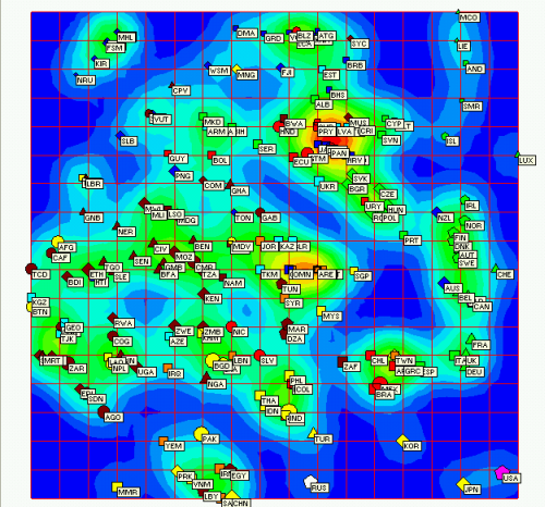
The nearest pointers on the map correspond to the countries that have similar or close indices values.
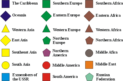
Colours and shapes of pointers reflect different geographical macro-regions.
The size of each pointer is proportional to logarithm of the population of the country.
Colouring by density represents clusters in data distribution.
Colouring by index represents the distribution of each index.
The vertical and horizontal axes are used for the results interpretation along with colouring by index.
Contact Us
Andrei Zinovyev
Aleksei Kolodyazhnyi


